When it comes to lead marketing, the power of a perfect landing page is impossible to ignore. With all the effort you put into your campaign, it may start stalling once the visitor arrives to your website.
Some marketers view landing pages as an addition to their paid ad effort. In reality, they are an integral part of the conversion strategy.
Flawless landing page design comes with an impressive ROI, complementing your traffic generation efforts and streamlining search optimisation strategies. Learning how it works can help you recognise obvious mistakes and build an ideal oasis for prospect conversion.
1. Start at the Top
Located on the very top, the headline is the key to an efficient landing page conversion. It makes a first impression, which without due effort can be the last. The headline drives the visitor to learn more about your offer and check out the CTA.
The headline should:
-
Grab the visitor's attention.
-
Tell the visitor about your offer.
-
Be short (not more than 10 – 15 words)
A headline can complement an image that explains the nature of your product or service. Its text should focus on the MAIN benefit.
The best headlines aren't clickbait but cliff-hangers. They pique interest and reveal just enough information to make the rest of the page interesting to the reader.
Examples:
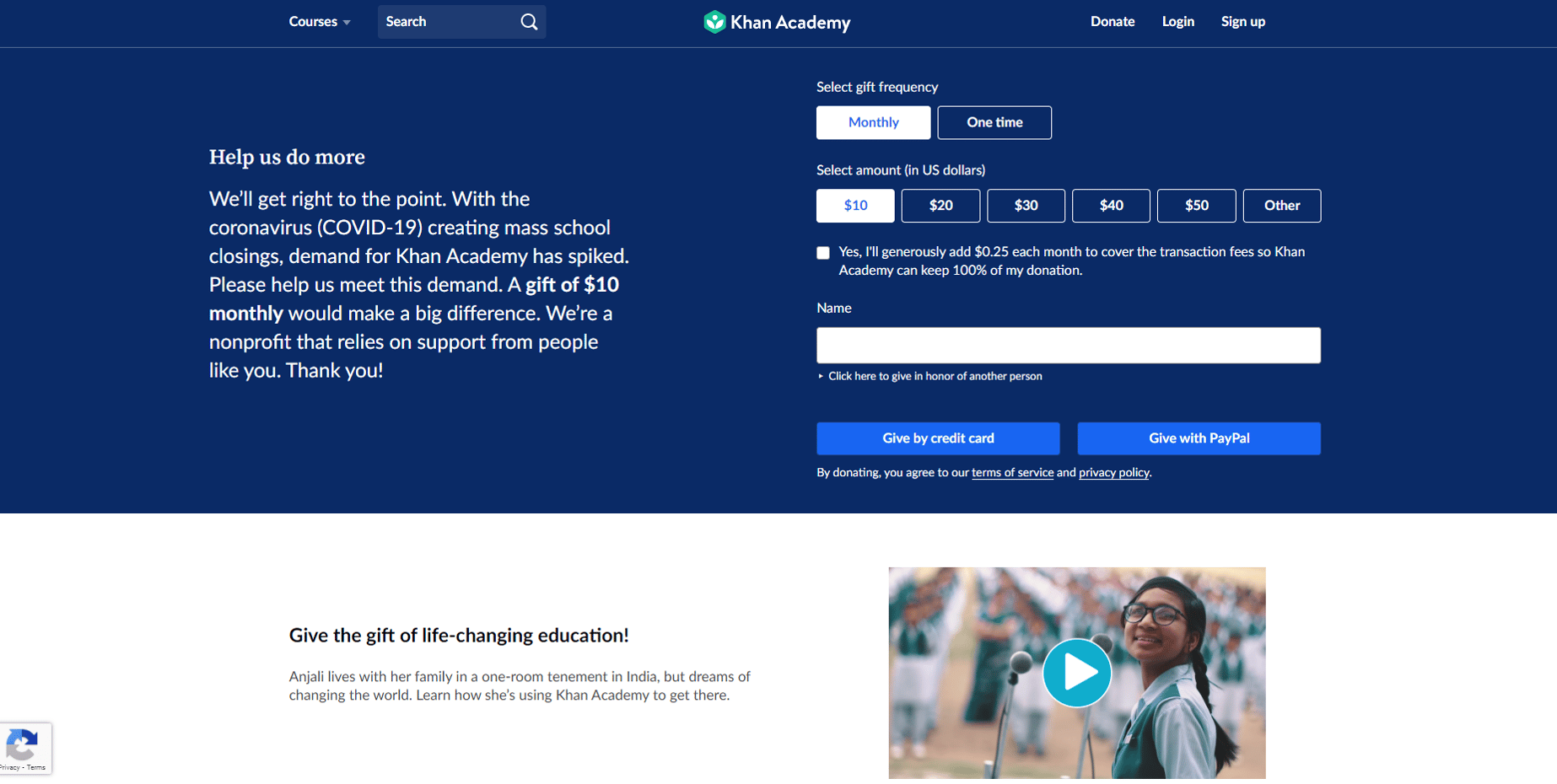
Khan Academy — "Help us do more."
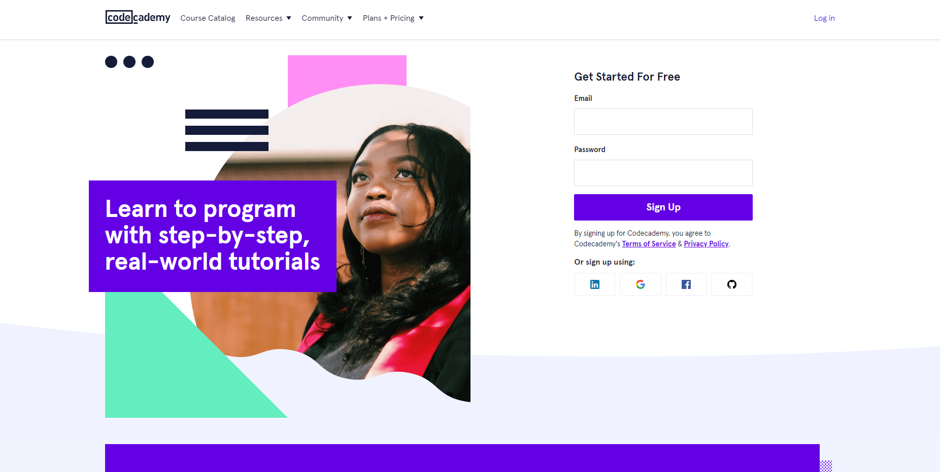
CodeAcademy — "Learn to program with step-by-step,real-world tutorials"
Airbnb — "Earn Money as an Airbnb host."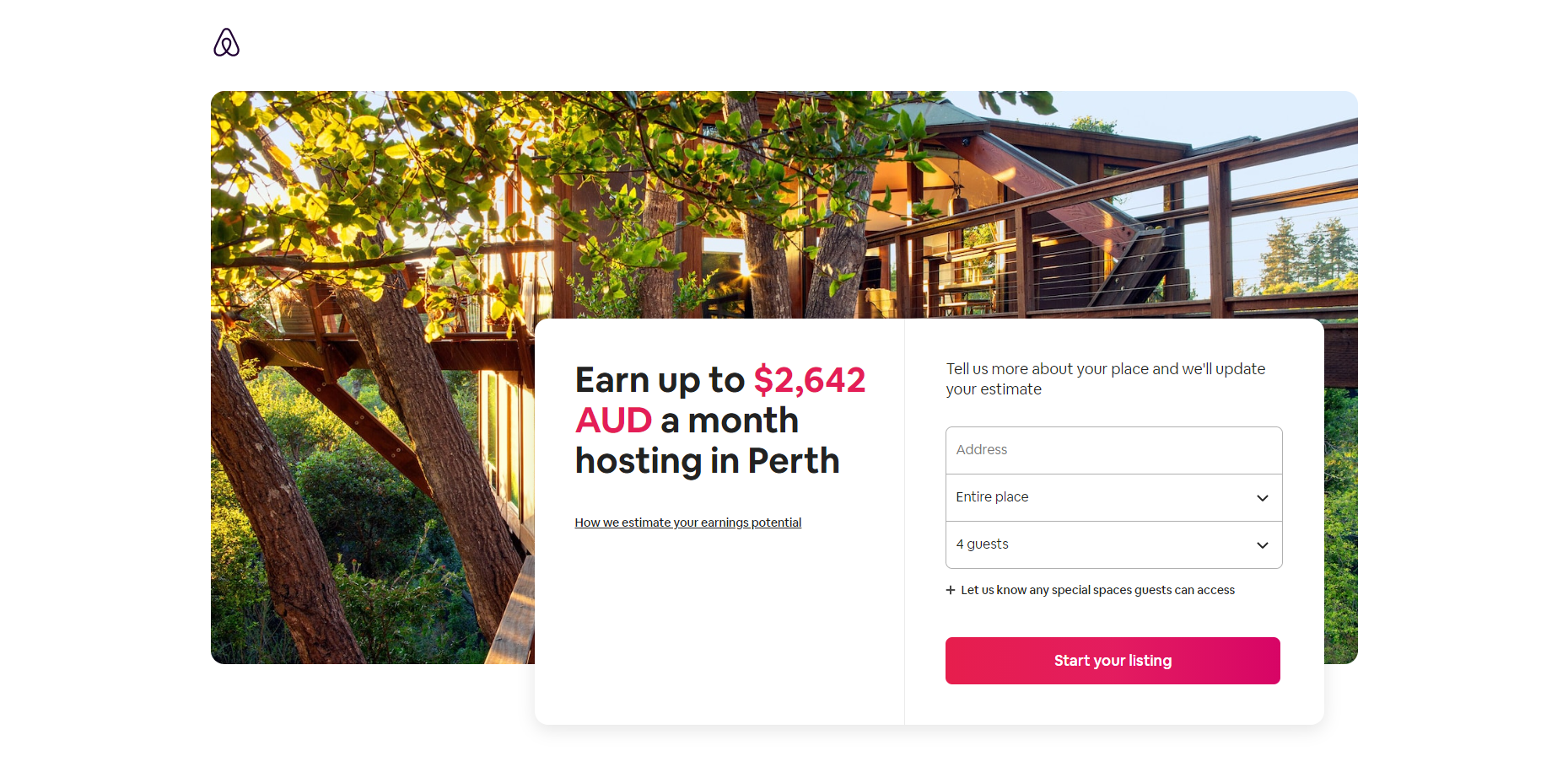
2. Work on the Subheading
Located under the headline, the subheading explains your offer further and reiterates your UVP (Unique Value Proposition). This is the place where you can share more details.
Subheadings should carry an element of persuasiveness, urging the reader to take advantage of your products and services. However, going into too many details can bore the visitor. Try to limit the subheading to two sentences.
Example (HubSpot + Canva):
- Heading — "How to Design Graphics That Convert."
- Subheading — "Create optimised graphics for promoting content on email, social media, landing pages, and more."
Keep the subheading concise and ensure impeccable grammar. When the text is short, each error stands out like a sore thumb.
3. Implement Visuals
Images and videos are an integral part of any landing page design. Since the human brain processes visuals 60,000 times faster than text, you can pack more information in an image than you can in written words, saving your audience precious time.
Visuals create an emotional foundation for your landing page:
- Use images of people so the audience can relate.
- People on the images should portray emotions that you want the reader to feel.
- Use top-notch images of the product.
- Show the product or service "in action".
Example: Australian Red Cross Lifeblood
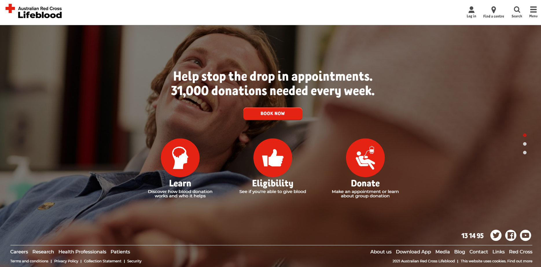 Consider using videos on your landing page. They allow you to pack more information in one small window while improving your conversion rates.
4. Add a Call to Action (One!)
CTA is the most important element of your landing page. It deserves the majority of your attention at the design stage. The best option is to add the CTA at the top AND at the bottom of the page so users never have to scroll to find it.
One smart way to add a CTA is to create a floating button, which is always visible. However, such an approach may annoy some visitors so a/b testing may be in order.
- Make sure that the message in the CTA and the heading match.
- CTAs and corresponding buttons must be colourful to catch the reader's attention. Consider using contrasting colours.
- CTA must be short and actionable.
- Repeat the reason why a reader should follow the CTA right below or above it.
- Make CTA larger than the rest of the text and buttons on the page.
Examples:
- "Sign up for free"
- "Let's make money together"
- "Send me my free e-book now"
- "Claim your free trial"
- "Get a discount now"
Limit one CTA per landing page. Two or more calls to action aren't a nice way to save money on creating multiple landing pages. They confuse the reader and leave buttons untouched.
5. Tweak your Form Design
Landing page visitors are always pressed for time. That's why it's imperative to make forms as short as possible. Otherwise, they could simply abandon the landing page, increasing your bounce rate.
Another reason for brevity is typos. The more fields you add to the form, the more opportunities a visitor has for making mistakes. A typo in an email address could cost you a lead.
Avoid using a "submit" button on your forms. It could force the visitor to think about whether to submit or not. Replace it with a CTA like "Get my free membership now," or "Claim your 10% discount."
6. Provide Testimonials at the Bottom
Both B2C and B2B marketing efforts benefit from WOM (Word of the Mouth Marketing). Build trust with your visitors by placing reviews at the bottom of the page. They shouldn't take up too much space or interfere with your main message.
Reviews often become the deciding factor when the visitor debates the need to follow your CTA. Besides reviews and testimonials, you can build trust by sharing press mentions, certifications, and other proof of your value and integrity.
Tips to Keep in Mind When Designing Your Landing Page
While you are swimming through the technical lake, keep these actionable tips on the surface:
- Always think about your audience's pain points. Your entire landing page should focus on solving one of them.
- Be highly specific about what you want the user to do. A vague CTA calls for a vague reaction, minimising conversion opportunities dramatically.
- Don't hesitate to offer free content in exchange for an action on your landing page. High-quality articles, e-books, and white papers will bring you much more value if you offer them for free in exchange for a click. Selling them is a much less profitable venture.
- For the landing page to continue meeting your demand generation goals, you must be ready to keep adjusting it to the audience's ever-changing needs.
- A/b testing is an integral part of growth marketing. Even a small adjustment to the design can make a huge difference in your conversion rate. Things to a/b test on your landing page are CTAs, images, landing page and ad copy, navigation bars.
- Stick to a simple layout. Simplicity is the landing page's key to success. The fewer distracting factors you add, the better your CTA will stand out. Keep all the information above the fold.
- Try not to add many links. They lead the visitor to other pages and away from your CTA.
- Remove the navigation bars to prevent the visitor's attention from wandering to other pages.
Remember, no matter how well the landing page looks, high-quality copy is the key to successful conversion.
5 Free Landing Page Tools
These free landing page building tool can help you design a perfect landing page:
- SITE 123 — can help you build single-page websites.
- Weebly — easy to use, has numerous landing page templates.
- Leadpages — dedicated advanced website builder (comes with a 14-day free trial).
- Ucraft - website builder with a free landing page creator.
- Carrd — free one-page website builder with a wide range of templates and a low learning curve
Using the above tools can help you create high-quality landing pages while keeping the key guidelines in mind.
Are You Ready to Design a Perfect Landing Page?
Digital transformation starts with attention to detail. Tweaking your landing page to maximise conversion is vital to your campaign's success. With the right tools in hand, you can enhance the landing page design and improve your company's bottom line. #e8238c
If you need help creating an efficient landing page, don't hesitate to give us a call. At Fileroom, we offer a variety of flexible digital content solutions to power up your marketing campaign



.png)
